Thursday, 15 December 2011

HK: Feedback from sample footage

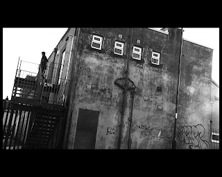
The last 3 weeks we have been working hard on producing some sample footage for our video, we currently have 45 seconds of footage that was shot over 4 shooting sessions, two were at school, one by the railway bridge and one down at the industrial estate location.

The sample footage helped us get a better understanding of what our end product can/will look like and what effects looked good, what locations and camera angles were right, and even what wasn't so great.

The first time we showed our work to others was at the schools creative art's evening, this was an evening put on by school showcasing work from the media, drama and music department and was full of creative minds who could offer helpful feedback about our product, we were even lucky enough to have the headteacher view our work which was a great honour.

The feedback we got from creative arts evening:  
  • People didn't really know what was going on, there wasnt any anchorage that gave the audience an idea of what was happening in the video and why and what our character was trying to escape from and what relevance did all the shots of Mac's and other miscellaneous objects have to do with this. 
How we will change our product after the feedback:
  • We think the main reason people didn't know what was going on was because the footage we showed them was only 45 seconds long which really isn't that long to provide any real anchorage especially with our idea that 'Technology is Bad' it is hard to portray that in such a short clip so we think that we will just have to work on getting more footage and then getting more feedback to see whether with more time the audience got a better understanding of what was going on.
We also showed our work in our Media lesson which is full of young talented minds ready to make their break in the music video world, so is good to get other media students to give their creative opinions on our work.

Feedback we got:
  • Include more subliminal messages
  • Perhaps get the character to get on the train, this would give us scope to go to new locations
  • The fast pace editing was good gave an intense feel to the video
  • Good use of effects, thought that the Black and White effect worked well.
  • Expand locations to more urban areas such as Leeds and mainly Bradford.
How we plan to adapt to feedback:
  • Start location scouting around Leeds and Bradford, we already have one location in mind in Leeds and two of us being born and bred in Bradford have good local knowledge and and a few locations in mind for places in Bradford.
  • We need to think about good ways to include our illuminati symbolism 
Feedback from our media teacher:
  • The scene when Ben walks backwards should be changed because it gave a comedy feel, which wasn't all what we were wanting.
  • Didn't think that Ben was right for the role.
How we are going to change:
  • We are going to edit out the backwards walking scene to make sure we have the correct intentions for our video.
  • We have started looking for different people to cast for our role instead of Ben.


BH: Nine Inch Nails- Perfect Drug


Director: Mark Romanek
Year: 1998
Genre: Industrial/Rock
Audience: 15-24 (24-35)

This song was originally written for David Lynch's Lost Highway (1997)


Nine Inch Nails: The Perfect Drug (1997) from Nine Inch Nails on Vimeo.


The decayed/gothic
setting of the video.


The first shot, the removal of a lens cap from a Victorian camera, into a mirror to give the effect of fish eye immediately sets the tone, the lighting is dark and tinted blue to show this idea of moodiness and a dark environment, you can see clearly that the walls are grimy and dirty. This is elaborated on in the next shot, a long shot of Reznor at 0:04 seconds, the floorboards are dirty and covered in litter, various instruments hang up behind him and he's staring at music sheets and yet he isn't actually doing anything other than staring which lends itself to the idea that the character is depressed, he's hunched forward over the piano, he'. The next shot at 0:05 is a very brief close up of the three band members playing string instruments, once again the black clothing is revealed to be a fit with the general visual style of the video. The next shot at 0:06 is Reznor by himself playing the same instruments as his band, sitting, long shot facing the camera. At 0:09, we have a medium close up of Reznor staring at the music sheets featured previously, the shot is more side on profile, we takes a deep breath and sighs, once again the indication that he's not a healthy individual. The next shot is framed interestingly. it's of a urn but only the bottom out of shot and the sky, lending the idea of a highly stylised music video.
At 0:14 it makes a return only this time the bottom is seen with a pair of legs and the rest of the body hidden, the idea being hinted at appears to be death of someone, the sky is very grey/blue. At 0:22, it's revisited again for a close up, but once again the shots are very brief, the pace of editing here is rapid.


At 0:29 the framing of the shot is very interesting because we can see half of Reznors head hidden behind a curtain as he lip sync's.
2:33 the video goes green tinted, to match with the drum solo, the pace of editing here picks up rapidly- the green tint to signify the alcohol taking control of the character. At 2:58 the video appears to take much more melancholy video with a longshot showing the full body of the character, leaning towards the camera following the melancholy.


An example of the abstract imagery


The video is very dark throughout in terms of actual lighting, with the opened shot of the singer and a small boy looking in a mirror removing the cap of an old fashion style camera. Instantly showing that this isn't set in the modern day, reinforced by the attire of the two characters. The video prominently features abstract Victorian imagery and is overall a very 'concept' driven video- however if you watch closely you can see certain aspects of narrative- the reoccurring image of the young boy for instance throughout the video hints at some form of meaning. Listening to the lyrics in the last minute of the song it's implied that the boy has died (as indicated by the two women dressed in black) and that the father (the singer/ Trent Reznor) is in mourning and has turned to alcohol, also indicated t.hrough the green liquid shown in several extreme close up shots.

The location is VERY gothic and dark, the old Victorian esq walls, something seen in previous industrial videos, where the focus here is not on the decay of society but on the decay of the mind, as indicated though Reznors decline into alcohol abuse in the video.


Abisinth close-up.
hinting at the 'meaning'


As indicated by the abisinth seen in select shots. There are several long shots of the father, often alone or staring into the distance at something out of shots, as the video goes on these shots are often revisited for close-ups to put emphases on the isolation of the character, in several shots however he appears to be hidden or hiding (i.e the water shots and curtain ones.)


A med-close up showing the father
looking out of shot.


At the time the video was fairly expensive with the refrigerated set used and the renting of certain artworks featured throughout the video, these led to a reported $1million music video

Wednesday, 14 December 2011

KM: KMFDM - Meglomaniac


Artist: KMFDM
Song Title: Megalomaniac
Genre: Industrial Metal
Year: 1997
Primary Audience: Male 15-24


Fish eye lens
- The video starts off with film like titles and opening credits, displaying the actors featured in the video. These are shown while the track is already being played in the background.


- From 0:53 to 1:08 there is a continuous close up shot of the vocalist lip-syncing, as the shot goes on it is edited in a number of ways, such as the focus being adjusted, the lighting being altered, and binary code being displayed on a separate video layer over the top.


- At 1:11 a stop-motion video effect is used of a policeman beating a man with a baton, (before they end up kissing) and cutting from words like "fake", "malicious", and "marijuana". These words, along with the homosexual aspect signify the rebellious and controversial motif of the song.


- A 'fish eye lens' is used at 1:17, which is something we have already incorporated into the sample footage for our music video, for when our protagonist is walking over a bridge.


- Laura Mulvey's 'male gaze' theory is relevant in this video at 1:21, where a woman wearing heavy make up and a revealing nurses uniform is the centre of the shot, before cutting to a shot of her dancing in a capsule labelled "EXTRA STRENGTH KMFDM 300MG". This shot links in with the lyrics as the words "better than the best" appear on screen as the words are sung.


- At 1:47 the video then gives the effect of a flight simulator/ vintage video game. This relates to the electronic sound of the music that is played at this time in the track, as it sounds like it could be the soundtrack to an old video game.


- An interesting shot used at 2:24 shows the album that the track is featured on, we have a similar idea which we are thinking of using in our video of bringing the digipak that we are going to creat into the diegetic world of the music video.


- Another shot of note occurs at 2:35 where an image of an eye appears on a TV screen in shot, I have noticed similar shots of eyes in other videos of the Industrial metal genre, such as "Stigmata" by Ministry, on which I have previously blogged. This is also very similar to our own idea of displaying the illuminati "all seeing eye" on a number iMac screens.


- The controversial theme of this video is again displayed at 2:38 where there is an on screen animation of a man choking someone with a wire, this is continued at 2:52 with a scene where there is an implied killing of a man with an electric drill, and at 4:00 with the nurse smothering a patient.


- There is no full band performance, but there are aspects of individual performance, such as the vocalist lip syncing throughout, and close ups of instruments being played, such as the guitar fretboard at 3:34.


Thursday, 8 December 2011

HK: Nine Inch Nails - Closer

Artist: Nine Inch Nails
Track: Closer
Director: Mark Romanak
Year: 1994
Audience: 15 - 24
Genre: Industrial Metal

The video for this track is a hybrid of performance and concept.

It starts of with an old film style introduction, similar to what would be played before old silent movies.
at 0:09 we see a chair with a heart on, this straight away conveys an element of horror and gore to the video.

The modern, clean chair seen at 0:09 contrasts with the decaying, grotty wall seen behind.

We find out at 0:10 that the heart is is still beating and the close up at 13 really shows this by making the heart the focus of the shot and the heart beating to the beat of the song with steam coming out of it too which makes the heart look like a machine, this could be a reference that the human race is becoming more and more technologically dependant and that we need technology in order to stay alive.

At 0:14 we get a long shot establishing more of the location but the actual location is still pretty ambiguous and we don't have much anchorage of where we actually are but there the location shown is very dusty and looks decayed.

By 0:16 the mise en scene is very bizarre we see leather bound books and a model of an armadillo, this gives us a hint that the location is something to do with animals and research. At 0.17 the dusted telephone and the old fuzzy TV shows the resistance to technology and the fact that the tv has no signal could be linked to the alienation of the location or of the man in the video.

0.19 a close up of a skeleton is a binary opposite to the earlier beating heart.
0.20 We have a first shot, moodily lit,silhouetted shot of the singer gives a sense of mystery to the video as we don't see his face.

There is a juttering and focus/out of focus camera effect at 0.25 adds panic to the video. At 0:28 there are candles, these are add surrealism to the video and give a dark, eerie feel.
There is focus on the bald naked woman at 0.39 the fact that her head is shaved is proving that the woman is not there for male gaze, even though she is displaying her feminine, naked body the intentions of her being naked aren't for her to be seen as a sex symbol but more to show the mixture between her femininity but still being powerful.

We get an idea of who the silhouetted singer is as there is a well lit close up on a man that looks like he could fit the looks of the silhouette.
At 0:52 there is a sign saying COPYRIGHTED this could be a reference to how society is controlled and we are even copyrighted.

There is a close up of a band member at 1:00 and he his wearing a dusted black leather jacket and has dark hair, what particularly stands out is his googles that don't reveal his eyes keeping with the mystery of the video with him not revealing his whole self to the camera.
There is also a smoke machine effect used during this lipsyncing this too also adding mystery around the character.

The goggles worn here are similiar to those that the male guitarist in Hanzel Und Gretyl.

A panning effect is used to the beat when the shot of the monkey on the cross, the monkey on the cross is almost toying with religion and replacing Jesus with a monkey. The longest shot in the video is at 1.25 with Trent Reznor hovering in the air for as the song goes into an instrumental.

Next at 1.43 the shot of the dusted old film tape again shows the resistance to technology. At 3.06 we see a metro dome with an eye on it symbolising that someone is watching at the the fact that the metro dome is to do with time could link to the idea that someone has an EYE on us all the TIME.
4.10 gives us anchorage that someone out there is watching on what looks like through an old surveillance camera/tv.


Nine Inch Nails: Closer (Uncensored) (1994) from Nine Inch Nails on Vimeo.


Wednesday, 7 December 2011

BH- A brief History of the Genre/Artist in Genre


Industrial began as early as the late 70's as a new wave of experimentation, with the advance of technology it became easier for the use of electronic sounds. The coining of the phrase 'Industrial' came from the founding of 'Industrial Records' by early industrial band Throbbing Gristle with the phrase 'Industrial music for Industrial people'.
Cabaret Voltaire 
Of course the genre can draw its roots from Punk, Electronic and generally very Experimental music. With this we can gather that Industrial draws from a wide range of genres coming together. Cabaret Voltaire feature heavily in the early industrial scene, creating loops, physically cutting up the tapes. 
With the 70's drawing to a close, came the rapid expansion of the industrial scene into other countries it began with more and more artists picking up on this new sound- more electronic, more making music out of sound almost- with the use of samples.  With the event of the 80's the whole genre becamemore and more focus on the 'computer' sound of the effects and we began to see more and more offshoots appear as the genre gained a wider appeal however it did, for the most part still remain underground. We saw heavily controversial arise to attack what they saw as a very over commercial scene- Skinny Puppy releasing music videos intended to shock and cause controversy- hence sealing them as an underground band. Ministry also cropped up around this time as another offshoot of industrial (Industrial Metal) featuring very controversial lyrics often political- indicating another hallmark of the industrial genre- difficult lyrics tackling everything from personal issues to highly political issues.  

Tuesday, 6 December 2011

HK: Pyscolon Nine - Parasitic

Artist: Pyscolon Nine
Track: Parasitic
Director: Richard Thomas
Year: 2008
Audience: 15 - 24
Genre: Industrial Metal

Straight away we see that a green lighting effect is being used, but the opening lacks anchorage we don't know where we are or who or what the figure is.
A juttering effect starts as the character walks down this tunnel looking place.
Cross-cutting between to another shot which we have no idea what's in the shot the only thing we recognise is that the shot has an orange lighting effect to it. The realism is lost and it is apparent that realism isn't the editing effect meant for this video as the character walking down the pathway goes cuts backwards rather than forwards losing the real-time verasimilatude of the video.
The low angle panning shot at 0:20 gives us a better idea of what the earlier orange shot was but we don't get that much and there is still narrative enigma as all we can see is a black silloute with an instrument, the low angle also making the character look scarier and there is an element of horror.
At 0:22 there is a zoom onto a bottle that looks like it could be either alcohol or poison, though the rotten apple next to it could be an inter textual reference to the poisoned apple from the tale Snow White and The Seven Dwarfs.
At 0:26 there is a high angle Dutch angle looking down upon a man in hooded robes surrounded by candles, this looks like dark magic, it his here that colouring effects become a large part with it flashing negative and the same shot but different colours. There is a juttering camera effect at 0:31.
At 1:05 we get more idea of where the location for the performance footage is from it is set in a run down/ trashed flat.
The lip-syncing starts at 1:44 and stays with this shot for a long time though the shot is kept alive by the lighting effects flashing upon the person lip-syncing.
There is use of multiple layering effects at 2.27.
We get anchorage at 4.05 and 3 of the features of the video link together, the character from the very beginning, the man in the robe and the bottle. We get anchorage that the bottle was poison through the singer   mimicking dieing.
The combination of the hyper fast editing and the strobe lights give a visceral response reaction to the audience with it hurting your eyes and making you feel uncomfortable.


HK: Hanzel und Gretyl - SS Deathstar Supergalactik

Artist: Hanzel Und Gretyl
Song: SS Deathstar Supergalactik
Year: 2003
Genre: Industrial Metal
Audience: 15 - 24
Director: Nasty Byte

This video is a purely performance based video. The location of the video is straight away apparent as you can tell from the medium opening shot that the video is filmed on stage.
The woman in the shot is wearing what looks to be dark leather and covering alot of skin, usually in music video a woman would be wearing more revealling outfits to bring in a male gaze though there is no anchorage here for the women to be coming across in an attractive way.
She is playing the guitar with it being very low slung down by her knee's and is headbanging to the beat of the song.
The video then cuts to a shot at 0.10 of 3 band members and microphones we are given definate anchorage at this point that the video is set on stage though this shot still doesnt show any of the band's faces as the womens hair is blocking our view from the side.
There is a shot of the drummer but there is no lighting focused on him and you cannot see any of his features just a slight silloute.
At 0.23 there is the first proper shot of the man on stage doing a salute the man is dressed in clothes similar to that worn by Nazi Youth or German schoolchildren during the war he is also wearing goggles that block out is eyes and give him a more powerful, more surreal look.
At 0.29 a low angle medium long shot zooms into just the guitar being played cropping out the woman's face and it just focusing on the strings being strum. Text and images start to flash from the screen behind but we cant see what the images are due to the multiple layering effect being used, creating narrative enigma, lacking anchorage.
At 1:45 there is a low angle shot looking up at the female singer making her look bigger and more powerful. This is again given anchorage by putting a close up on her whilst she is singing showing her feirce facial expressions and is not trying to look attractive or girly at all.
Panning and zooming from one band member to another starts and has an amateur camerwork effect.
At 2:30 as the song slows down there is longer shots and less shot variation focusing on the woman speaking where there is alot of bright lighting shone one her face gives an aspect of  a dreamworld, losing verasimilatude
When the song kicks back again we finally get a shot of the drummers face. Behind the stage after this at 3.30  the bands name and text keeps flashing in a brainwashing kind of manner.


HK: Deathstars - Cyanide

Artist: Deathstars
Track: Cyanide
Year: 2006
Genre: Industrial Metal
Audience: 15 - 24

Deathstars are a Swedish Industrial/ Gothic Metal band.
The video for this song is a mixture of performance and narrative with the video cross cutting between shots of the band and of a physco hospital.

The opening of the video has alot of narrative enigma, we dont really see the location no establishing shot is used to give the audience anchorage nor do we see any of the characters faces fully. The decaying, grotty tap head shows the band's resistance to modern technology which is someone ironic as the production of the music for industrial metal requires highly technological software to create.
It is apparent that a green filter has been used for the editing and with the silloute of the hand reaching out it is clear that the video has an aspect of horror.
There is juxtoposition of what looks to be ranked soldiers but in a church, multiple layering is used here
The shot of the guitarist shows the clothing codes of this genre, dark clothing dreadlocks and a wristband is worn by him whilst he plays his low slung guitar and he drops the guitar down to the beat of the song and a juttering effect is used this is not naturalistic editing.
at 0:21 the editing really begins to pick up pace crosscutting between shots of a needle, bare legs in a wheelchair and a lab rat this lacks anchorage and maintains polysemic which could connote that the female is the lab rat.
At 0:27 We see the guitarist again where his face is out of focus still keeping narrative enigma, after this at 0.30 seconds there is a centre of focus shot where only his face and a small area of the drumkit are in focus, we see that he is wearing a black eyeshadow which contrasts with his pale face also he is wearing contact lenses to keep the horror theme running. At 0.35 the lead singer slowly rises up  just revealing his head and smoke effects are used.
There is a drum beat shot that pans to the beat, panning left on one beat stopping on another then panning right on the third beat.
At 0.48 multiple layering similiar to the japanese horror film The Ring.
by 1.02 We the narrative enigma is finally revealed and we see that the people pushing the wheelchair are in fact band members.
The singer is using a old microphone again showing resistance to technology.
1.59 the army crowd are now involved in the lipsyncing and the singers body language starts to get aggresive.
An eye reflection effect is used this could either be done whilst filming or editing.
at 3.29 an effect is used where fire appears in the band members eyes whilst the lyrics go 'fire in the eyes'
The song finishes with an abstract ending of a beating heart could be signifying that the heart is still beating and that there is more to come.

HK: Illuminati In Music Video


The idea of the Illuminati is very similiar to the theme we are potraying in our idea that like the Illuminati, media and technology are also all knowing and all powerful.

Illuminati symbolism appears in so many places and we don't even realise. On the tv, on the street and even the American dollar bill!

But music video is a format of media that gets a large amount of speculation over illuminati references. Which symbolism appearing (debatabley) in huge artists like Rihanna, Jay Z and Lady Gaga.

The subliminal messages cause an outcry online with people spamming the YouTube comments sections and forums online creating  moral panic and a whole range of conspiracy theories, and without them knowing they have actually just become a secondary audience for the video's.

So adding these subtle references can create such a large hype to your video and after all any publicity is good publicity.


Sunday, 4 December 2011

HK: Evaluation of Research

After looking at a large range of industrial metal tracks i have begun to see the codes and conventions that seem to be common in the video's for this Genre.

Lighting, Usually the lighting in the video is very dark or even in just black and white also the use of a coloured tint is common, featuring a blue tint in Rob Zombie- Living Dead Girl. A green tint is used in the video for Parasite by Pyscolon Nine and a slight green effect in Deathstars - Cyanide.

Mise En Scene-
The mise on scene for the bands is a cross between Punk and Gothic, usually dark, black clothes which is a clothing convention of most heavy metal and gothic bands which has been with the genre since early pioneers of the metal genre such as Metallica and Megadeath.
Theres influences of army uniform lots of leather and lots of black and usually the band members come across quite scary and hardcore.


Goodwins Theory - The video's are mostly a mixture of concept and performance. Though there are few shots of the band all together the shots are focusing on specific areas of the band such as the drumset or person playing guitar without showing there face.
A common occurence was that in most of the videos especially Deathstars - Cyanide and Oomph- Augen Auf they have a lot of emphasis and attention towards the frontman of the band, giving them a different, more striking appereance and given them alot more camera time and focus than other band members.

Location- For the performance aspects of the videos the band is often underground or in an abandoned location such as warehouse sort of building or car park like Ramnstein's video for Kein Lust.

Women- There is no large focus on male gaze in the videos I looked at except from the two women in Ramnstein's Kein Lust.
But all others didn't have any women dancing around in little clothing and there is very little glitz or glamour in industrial metal video's no gold bling or blacked out range rovers.

BH: How To Destroy Angels


BH- How To Destroy Angels- Space Between

Artist: How to Destroy Angels
Director: Rupert Sanders (Snow white & the huntsman)
Year:2010
Genre: POST- Industrial
Audience: 24-35 (15-24)
(The video was only ever released online as such only those with a prior knowledge of Reznors work would have heard of the band)
How to Destroy Angles (HTDA) is a group with Reznor, his wife Mariqueen Maandig & Atticus Ross, with a very electronic sound, one that differs from nine inch nails significantly and yet is another outpost for Reznor & Ross' dark electronic sounds.


Judging from the style of the video I'd say a HD camera was used, the clarity and camera work would seem to indicate this.
It's a very narrative video, well not that much happens, the scene is one of a hotel murder, of a bride and groom I assume who've been killed on their wedding night, played by Mariqueen and Trent respectivly, whilst being watched by Atticus Ross and a blonde woman as a fire starts and engulfs the scene as Atticus and the woman watch on calmly.


appearing at 0:36-38, a reveal of what's in the
hotel room. 
The first 7 seconds of the video feature a hallway shot, the number of doors and the tacky carpet signify a cheap american style motel, as does the window at the end of the hall, a small and cheap one with the curtains blowing. The camera work here is a slow zoom- tightly frames so that the walls just are in view.
We then jump forwards with a swift cut to the window and a door slightly open at the side of the frame, indicating danger.
A performance aspect is introduced through the corpse of the bride singing, something that becomes quite macabre as she begins to set alight and burn slowly. They've said the way that they've done this was to have her singing them impose her face onto a mannequin- although the effect isn't all that well done it certainly adds to the video and takes nothing away.
What's interesting to note is the messing around of focus on the camera with the 'depths' changing so what was blurred becomes clear.
The blood effect is used brilliantly in this video with the blood looking realistically dark and maybe ever so slightly desaturated.
One example of a really well framed shot would be the one you see to your right. The lighting in the window is done so that it glows in ever so slightly, the curtains seem dirty, not overly so but enough to fit with the 'vibe' of the video. The bride laying against the bed, with the bed ever so slightly jutting in the right of the shot and behind her, the corpse of the groom, their attire a white, frilly dress and the grey well fitted suit would indicate a wedding. The lighting here is typical of the genre, dark and moody with heavy use of shadow.


Shot of a candle appearing at 0:48
The candle seems to be a common aspect, appearing at 0:48 seconds and staying onscreen for a good 2 seconds before vanishing, the candle blowing gently in the wind, the idea that something somewhere is causing a breeze which then lends itself to the aspect of intrusion, someone having come in and killed the occupants of the hotel room.  It could also indicate a sense of fragility, the wax gently protecting the flame. It also shows that some amount of time has passed in the room seeing as though the wax has clearly been worn down, adding to the theme of decay that features in the video.


The sense of mystery continues in the video, with several shots focusing on the fingers, or the hands or someone smoking. Sometimes not even body parts but instead objects, gently spattered with blood to indicate that something violent has happened, such as at 0:53, we have a womans hand (painted black finger nails) with what looks to be a broken glass just out of reach and covered in blood- indicating a struggle and the closeness of the object showing that it was maybe a self defence wound, either way the violence of the video is pretty heavy and it becomes much worse when the bodies and the room begin to burn, with heavy use of special effects to show the lip syncing even as the body is burning, they used a mannequin to burn with a wig then superimposed Mariqueens face onto it to get the desired effect, i.e one to shock and disturb the viewer.
Overall the video is one that seems to be much more modern that prior industrial videos and is clearly following a narrative and the editing clearly draws the viewer into the scene that's unfolding on screen. 

Thursday, 1 December 2011

KM - "Ministry - Stigmata" Deconstruction


Artist: Ministry
Song Title: Stigmata
Genre: Industrial Metal
Year: 2005
Primary Audience: Male 15-24


- Black and white footage is used throughout the video, which is something we are going to implement in our music video and this effect is often used in videos of the industrial metal genre.


Machinery
-  Multiple video layers are used, for example at 0:13, we are thinking about using this idea in our music video and are going to experiment with it and our newly filmed sample footage.


- There are religious references in the video such as the cross at 0:14. This common convention that I have noticed in several industrial metal videos, such as 'Nine Inch Nails - Closer'.


- Footage is slowed down at 0:22 for a long take, to signify a flashback.


- Live band performance footage is used frequently (0:50).


- An interesting POV shot is used at 0:44, we experimented with a similar POV shot today (6th December) during our sample filming in Ilkley.


- There are a lot of shaky, fast moving camera shots used, for example at 0:54, this helps signify the live performance setting. Blurry footage is also used for the same effect, for example at 1:06.


- There is a change at 1:12 in the video, as the camera erratically zooms in and out and shakes, this is to fit in with the double bass drum beat which kicks in at the same time.


- Sped up footage is used at 1:26, to signify the atmosphere of the live setting, this features again on many occasions such as at 1:34.


- Footage of machinery is shown at 1:45, linking in to the 'Industrial' genre, as songs from this genre often feature the sound of machinery.


-  A very unusual section of this music video is from 2:08 to 2:21, where very fast pace editing is used to cycle through many different eye shots, which links in to the lyrics: "The look in your eyes..." This is a similar idea to a scene that we are planning to use for our music video, which is where our protagonist is in a room full of iMac computers, all with the illuminati "all seing eye" on screen.


Here is a link to the official video, as it can't be embedded.


POV shot.

Wednesday, 30 November 2011

HK: Industrial Metal Examples


Deathstars - Cyanide
Deathstars are a Swedish Industrial/ Gothic Metal band.
The video for this song is a mixture of performance and narrative with the video cross cutting between shots of the band and of a physco hospital.
In the performance footage there isn't shots of the whole band but more focusing on jusot one person, or even less with a close up of just an instrument even without showing any of the face.
The video focuses alot on the vocalist of the band, this is common in metal video's, the way the vocalist stands out here is through mise en scene and his army officer uniform is different to the other band members.


Oomph - Augen Auf


The video for song is quite a bizzare one, taken inspiration from Stanley Kubrick's The Shining, again cross cuts between 2 locations, where a mixture of concept and performance.
The shots for performance are similiar to Cyanide, with them also putting more attention on the vocalist.
The bands clothing is black, a big signifier of the genre of the music.


Ramnstein - Keine Lust
This video is entirely performance based and again has a large focus on the vocalist of the band, mise on scene here is very different with the band being in white, lighter clothing office wear, this is the sort of clothing we could consider including in our coursework piece to represent a victim of capitalism exploitation,


Another video I looked at from Ramnstein was their song Amerika, which is all about the Americanisation of the world, shows shots from people around the world from different cultures showing there Americanism's such as starving Africans eating takeaway pizza, the video also includes a colour effect changing from colour to a black/white/sepia effect.


Hanzel Und Gretyl - Take Me Too Your Leader.

This video is the first time in the genre where I have seen a video play any key part in the video, with her being one of the band members but what differs to most female artists is how they play with the male gaze to get more people to watch their video's but here Hanzel, is modestly clothed and not bearing much flesh.
The video shows many shots of New York locations and looks to be about the American dream and ultimately capitalism, with lyrics like 'take me to your leader' referring to their boss of the workforce being a leader making it seem like New York is like some sort of alien colony with people working for there leader.


Hanzel und Gretyl -SS Deathstar Supergalatick

A completely performance based video that includes dual layering effects that could be creates on Final Cut when editing.


Rob Zombie, Living Dead Girl

Has a flickery old film effect throughout the whole video making it quite uncomfortable to watch.


Sisters of Mercy, Lucretia.

The opening of this video is very similar to our idea, lots of shots of various everyday objects cutting to the beat.


Tuesday, 29 November 2011

Research Into Genre ( draft)

Deathstars
KMFDM
Hanzel and Gretyl
Oomph!
Ramnstein
Rob Zombie
Static X

Note KMFDM - Stars and Stripes similar to pitch idea style wise.

Wednesday, 16 November 2011

Group - Treatment

Untitled 1

HK: Inspiration. G.W.T.D.T


This is the trailer for the film Girl With The Dragon Tattoo, David Fincher. 2011
The hyper fast edited video trailer keeps you on the edge of your seats for the entire time and makes you not want to even blink at all otherwise you'll miss something.
The music fits perfectly with the editing, the clips cut to the exact beat and the combination of the cuts and the beat gets the adrenaline pumping through your body as you watch it.

0:55 to 1:29 is very similar to what we intend to do with the corridor scene, zooming to the end of the corridor, but cutting to different shots to make sure that we have a good variation of shots to make sure that the video follows conventions of music video and also making sure that the video is exiting.

Tuesday, 15 November 2011

HK: Production Company

We decided on the name HBK Productions as it a mixture of our initials Harry, Ben and Kyle and also taking inspiration from member of the 'big 4' in the music industry 'EMI'

It is the productions company's job to oversee and manage the production of the video, marketing and the digipak.

I created a logo for HBK Productions so that our company can be recognised and have its own ident, the main image is of a Vinyl record, this straight away shows that we are a music company, also the ransome note font for 'Productions' is similar to the Sex Pistols album ' Never Mind The Bollocks' this is providing a bit of intertextuality and will appeal to our target audience, whilst the HBK font is quite modern and cutting edge this shows that we work with both old bands and new.

 I also created HBK Productions its own Twitter page, this way fans of our music videos can follow us from around the world and have the latest updates on what we are doing, links to our behind the scenes production video's and merchandise.

Monday, 14 November 2011

HK: Target Audience

After researching alot into the industrial metal genre we could see what the target audience was.
Audience is usually divided into age, gender and social class, it is very important when creating a product to get a good understanding of the audience, and what codes and conventions they would be looking for.
 So once you get a better understanding of your audience you know what to include in your product and what will appeal to them.
We found that after research into the genre it was alot more popular amongst males than females, this is largely down to the fact that industrial metal genre is infact just a sub genre of the larger Metal genre which is usually affiliated with a more male audience because of the live performances and gigs being very heavy and full of people jumping around, head banging and moshing and very testosterone fuelled, things can get quite physical with mosh pits and walls of death which most femine women would not like to participate in this is very different to genres like Pop which have a higher female fanbase.

Our primary audience is males in the 15 - 24 age bracket as we are trying to re brand the Nine Inch Nails we wanted to appeal to a younger audience.
For this audience for the magazine advert we would plan to advertise in music magazine 'Kerrang!' This magazine is aimed at our core target audience

Our secondary audience were again males but this time in an older age bracket 25 - 34. This age category would be the ages of existing NIN fans who were fans of the band in the 90's but they have aged since then from being in 15- 24 now to the later age category. We are trying to look to create a product that also appeals to existing fans ( our secondary audience ) as well as the younger audience who arent necessarily existing NIN fans. For the magazine advert we would advertise in the magazine 'Q' as this magazine has the same audience as us.


Thursday, 10 November 2011

BH Costume/Casting


Well this is a subject that we've barely touched upon in full detail in our discussions about the video although we have decided upon using a teenage protagonist this means that we can have another connection with our audience. Because of how 'weird' we have planned our video to be, we would use the protagonist to really give our audience a way into the video.
We haven't really decided upon who else would appear in the video although /I think we do plan on including some basic performance shots but really keeping it to a minimum. 
Of course there are still issues to discuss such as should the singer also be the protagonist (something frequently done across all genres in the music video format) and should the band appear in the video, and if so then in what manner? 
Maybe something closer to 'The perfect Drug' where the other three band members appear as gentlemen dressing in top hats playing violins or later standing on the hill with canes in hand looking into the distance. but then the band have never really appearing in other videos (other than March if the pigs) all that clearly (cameo from Richard Patrick and Robin Fink in Down in It) so we are still debating as to whether we stick to the established Nine Inch Nails 'convention' of the focus just being on the singer.

HK: Location Scouting. Corridor

Corridor settings can provide a very great location and where better than a school?

I have 2 corridors in school in mind that would be fit for a corridor zoom scene:
The first I have in mind is a corridor in the new building of school on P floor or M floor, these are both very long floors with class rooms and lockers to the side would make for an epic zoom shot with black gaps in-between like the zoom from the trailer of girl in the dragon tattoo.
With the camera gradually zooming in to the end of the track in time with the music.
And the second on E floor, a similar but smaller and thinner corridor.
An example of a famous corridor scene would be The Shining.


HK: Key Influences On Video Narrative

An influence for which I would like to take inspiration for parts of my music video is a strange one, its a video game I remember playing on the PS2 years back: Mark Ecko's Getting Up.
The game is set in a strict, corrupt government controlled city.Where the population are watched and controlled by armed guards and under constant scrutiny by the law and freedom of expression is suppressed by an Orwellian city government.
The environment its set in is very similar to George Orwell's 1984 where it is similar, the population are oppressed by the government and watched 24 hours a day by 'Big Brother'

I would like to include elements of a dystopian world into our coursework, how teenagers are addicted and somewhat brainwashed by computers, technology and the media.. 

An uprising to this oppression is where the Getting Up influence comes from, amongst the government rule a group of graffiti writers start a movement through doing graffiti and starting a revolution to beating the system.
This is what we want for our video, someone breaking the digitisation and Americanisation of today's society.

Wednesday, 9 November 2011

KM - "Avenged Sevenfold - Afterlife" Denotation


First performance scene
Second performance scene
This video is mainly performance based, with two separate scenes of performance being used in the video, the first features the band performing in a warehouse, these scenes have heavy use of dark colours (such as in the form of the drum kit and amplifiers, as well as the actual colour of the warehouse) which relates to the music genre, which is hard rock/metal. The band member's clothing in these shots also indicate the genre, as one member is wearing a leather jacket and two members are wearing sleeveless tops, something interesting to point out here is that the rhythm guitarist is wearing a shirt and bow-tie, which relates to the narrative, as will be explained later. The second performance scene features the band performing with a green-screened bright white background, contrasting to the first performance scene, this relates to the lyrics, as it gives a surreal, heavenly feel to the performance, as the vocalist is singing about being in his "afterlife" and the first scene could symbolize life, and the second, death, as (something I learned from last year's media filming) white is often associated with death. This contrast is a theme that has been used with other aspects of mise-en-scene such as the instruments, for example the drum kit is mostly white in the second scene, and the lead guitar and bass have both changed from black to white. These details get even more precise in things such as the vocalist wearing white-rimmed glasses.

This video also contains some narrative as each band member has a separate scenario, such as guitarist Zacky Vengeance ballroom dancing and bassist Johnny Christ holding and then releasing some white doves. These pieces of narrative relate to the lyrics, as in the vocalist's, he is running away from the camera, while repeatedly looking back over his shoulder "move on dear, escape from this afterlife". The white doves relate to the religious aspect of the song "I pray by the grace of god that there's somebody listening" "Oh lord I'll try so hard, but you gotta let go of me". The tarantula on the drummer's face relates to the fear side of the lyrics "So out of place, don't wanna stay, I feel wrong and that's my sign." The lead guitarist Synyster Gates holding a skull relates to the whole of the lyrics in general, as the song is about dying too early. And the narrative scene of the ballroom dancing relates to missing loved ones "Got nothing against you and surely I'll miss you."

Last shot of video
In the performances there are quite a lot of close-ups of the vocalist, which is a common convention of music videos, as it reinforces the idea that it is him telling his story in the video, this focus is also used in the last shot of the video, as it is a long shot of the five band members walking towards the camera all wearing black, apart from the vocalist who is wearing a white top and is in the centre of the group.