 I made a couple of changes after receiving feedback from the rest of the media group; I first swapped the full URLs of the social networking sites with icons, as this looks better and most people are familiar with these icons. I 'onion skinned' the icons on Adobe flash, and changed the colours before adding them to the ad. I then used the 'layer mask' and 'gradient tool' on Photoshop to try to better blend the pictures together, in particular the "Beware of the CCTV" image, as we received feedback that the edges of this image were too defined. A problem I came across when doing this was the fact that when trying to blend the middle of the image to the background, the CCTV sign became harder to make out, so I focused on the sides of the image, so that you can still read the sign, but the edges aren't as noticeable. I also tried changing the fonts, but after trying various different ideas, I changed them back to my original fonts of; 'charlemagne standard' for the writing at the top of the ad, and 'myriad pro' for the social networking
Monday, 6 February 2012
KM: Magazine Advert Draft 2
Here is our 2nd magazine advert draft: (click here for full size image)
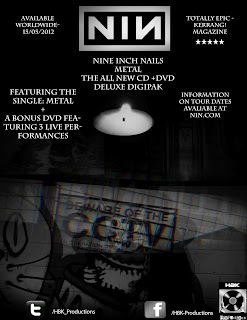 I made a couple of changes after receiving feedback from the rest of the media group; I first swapped the full URLs of the social networking sites with icons, as this looks better and most people are familiar with these icons. I 'onion skinned' the icons on Adobe flash, and changed the colours before adding them to the ad. I then used the 'layer mask' and 'gradient tool' on Photoshop to try to better blend the pictures together, in particular the "Beware of the CCTV" image, as we received feedback that the edges of this image were too defined. A problem I came across when doing this was the fact that when trying to blend the middle of the image to the background, the CCTV sign became harder to make out, so I focused on the sides of the image, so that you can still read the sign, but the edges aren't as noticeable. I also tried changing the fonts, but after trying various different ideas, I changed them back to my original fonts of; 'charlemagne standard' for the writing at the top of the ad, and 'myriad pro' for the social networking
I made a couple of changes after receiving feedback from the rest of the media group; I first swapped the full URLs of the social networking sites with icons, as this looks better and most people are familiar with these icons. I 'onion skinned' the icons on Adobe flash, and changed the colours before adding them to the ad. I then used the 'layer mask' and 'gradient tool' on Photoshop to try to better blend the pictures together, in particular the "Beware of the CCTV" image, as we received feedback that the edges of this image were too defined. A problem I came across when doing this was the fact that when trying to blend the middle of the image to the background, the CCTV sign became harder to make out, so I focused on the sides of the image, so that you can still read the sign, but the edges aren't as noticeable. I also tried changing the fonts, but after trying various different ideas, I changed them back to my original fonts of; 'charlemagne standard' for the writing at the top of the ad, and 'myriad pro' for the social networking
Subscribe to:
Post Comments (Atom)
No comments:
Post a Comment
All Comments Are Moderated