Tuesday, 31 January 2012

KM - 30 Seconds To Mars Magazine Ad (Kerrang!)

Things included:

  • Band Logo in the background of the advert
  • Mentions of the singles/ other artists featured (Kanye West)
  • Artwork of the album title/ band name
  • Fairly plain white background
  • Red coloured text
  • Simple Serif font
  • Record company logo
  • "OUT NOW" in large writing
  • Mention of the bonus DVD/ features


I plan on using a lot of the features of this digipak in our group's Nine Inch Nails digipak, such as; the band logo, the record company logo and details such as what singles are included and the bonus DVD. Something that doesn't feature in this magazine advert, but does often appear in others (and something we plan on including) is a number of tour dates on the advert

KM - Green Day magazine advert (Kerrang!)


Things that are included in this magazine advert:


  • Screenshot from the video for the single
  • Information about the album and single
  • Release dates
  • Image of album cover
  • Use of red and white font
  • Band name in large white font
  • Information about the included DVD
  • Record company logo
  • Official website information


This magazine advert is split in two, with the main focus of the top half being an image from the performance section of the video for "Wake Me Up When September Ends", and the band/ song name. The bottom half of the ad features all the information about what is included with the album/single. It's structured in this way so that the viewers attention is caught by the large image and this encourages them to read the details in the bottom half of the advert.

Monday, 30 January 2012

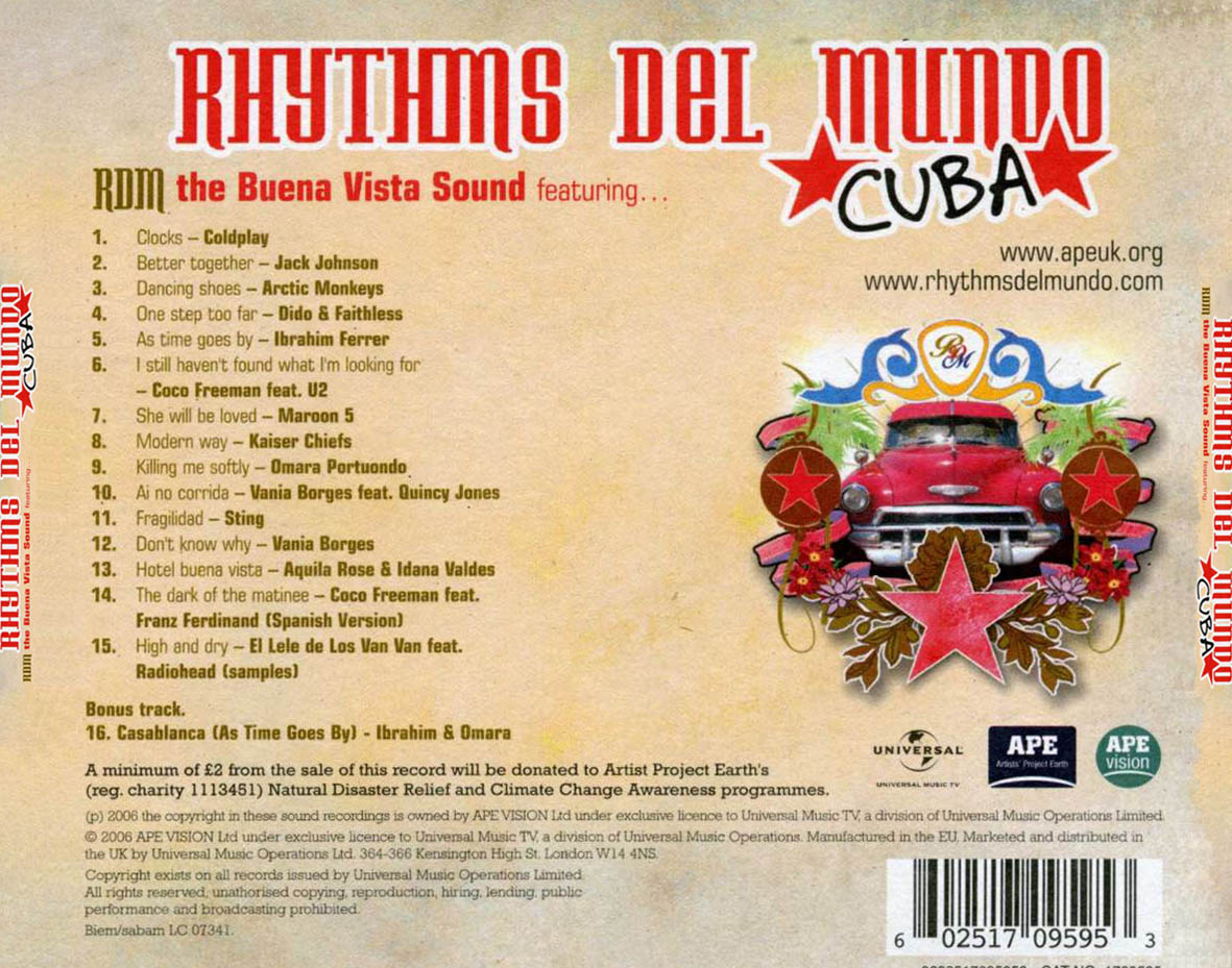
HK: Rythmns Del Mundo Digipak

This is the digipak of the a cuban jazz assortment band.

The cover image is very eye catching anf stands out against the textured cream background.
The colours and the brightness of the cover image really reflect the type of music and culture this digipak would be linked to.

The digipak doesnt have any stickers on the front but does have a list of what artists it does feature which does the same thing, advertising whats inside.


The inner has a background of a cuban building then on top of this is another layer, this layered effect could be created on the software Adobe Photoshop which we have at school.
There is a sign/banner saying 'Rythms Del Mundo'

At the bottom of the inner panel is a quote about climate change in a purple font.

The back has the albumn name written across the top largely.
Underneath this is who it's by and there is a a track list going numerically down from 1- 15 saying both the track and the artist as this is a compilation CD/
The graphic thats seen on the front is again showed on the back.
Below this is 3 logo's, one of the record label and two of the charity of which money is being donated too.
There is information on how some of the money raised from the CD will go to charity in a small black font.

Below this at the very bottom of the Digipak is copyright information on the CD.

In the bottom right of the back cover is a scannable bar code.


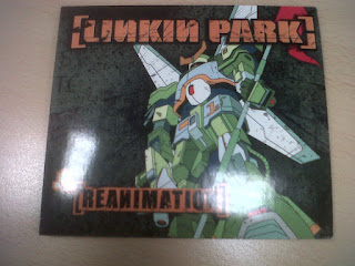
HK: Linkin Park Digipak

This is the Digipak for the album Reanimation by Linkin Park.

For this digipak they have gone for a cartoon/ animated graphic for there front cover.

The cover has an animated drawing of a robot or transformer type character.
The band logo is written in a large orange font in brackets along the top of the cover.

There is also the album name written in the bottom left corner in a bold black and orange font.

In the inner panels there are more graphics of the transformer character in various different poses.
All photos have similar background just that the actual transformer changes.

The Back

The text on the back of the digipak is quite confusing, it is set out like the standard list of tracks but the text is quite obscure in orange and white fonts.
There is a red banner along the bottom of the digipak, this has a scannable bar code, copyright information and logos of the production company.

HK: Digipak Research Podcast

  Evaluation Of Digipak Research by HPK

Friday, 27 January 2012

HK: Codes and Conventions of Digipaks

After looking at a range of different digipaks it was clear that there were codes and conventions that were similar throughout each digipak.


  •  Album and Artist Name - Every digipak I looked at had the name of the album and who it was by on the front cover of the album.
  • There is always either a picture or a textured background as the front cover.
  • The inner panels often include a photograph of some sort and the images of the panels are usually similar, if not the same image but just edited differently.
  • The image on the back is usually linked to the image on the front.
  • There is always a bar code on the digipak.

Thursday, 26 January 2012

HK: Girl With The Dragon Tatoo Digipak

Front
This Digipak is for the soundtrack for the film 'The Girl With The Dragon Tatoo' which has music produced by Nine Inch Nail's front man Trent Reznor and also Atticus Ross.

The front panel is a plain textured grey background which has a very feint silloute of a womans head.

It has the name of the soundtrack and the producers of the sound track.
There is a large, black sticker in the bottom right corner of the cover advertising what is included in the soundtrack like 'includes Immigrant Song'
Which is the biggest song of the soundtrack as it was used for the trailer to the film.

Inner

The first inner pannel is a better more clear image of the silhouette, this panel includes no text at all and is simply just the image of the head.

The second inner pannel has a photo of a shot from the trailer of the film.
It also includes text saying who the CD was composed and produced by.
Back
The back of this digipak is very minimalastic and is different to alot of digipaks as it doesnt include a list of what tracks are on the CD.
It has credits telling who did what also has logo's for the record company and the production company.
In the bottom right hand corner is a scannable barcode located for retail purposes

HK: Nine Inch Nails Digipak

This is the digipak for the  digitally remastered gift edition of Nine Inch Nails album 'Pretty Hate Machine'

Front

The front cover has an image that has been edited to add more effect to the image, though it is hard to work out what the image actually is on the front cover but it is and ECU focusing on what looks like some sort of metal object which is common in industrial metal videos to include random shots of miscellaneous objects.
Over the image is a black banner that has the artist name and the name of the album.


Inner
One of the panels has a dark background image which again can't make out what it is but in the centre of this panel is the iconic NIN logo.
The CD and the right panel are linked to the front cover they have the cover image but further zoomed in and the cd is the ECU very zoomed in but edited and a different colour effect has been added.

Back
The back of the digipak has information of the tracks on the album, a scannable bar code, some information on copyright disclaimers.
The company logo's of the record company and the production company

KM - Research Into Magazine Advertisements


Example of magazine advert
To prepare for creating our own magazine advert for our Nine Inch Nails digipak, I've been looking at several examples already found in magazines, the main one being Kerrang, due to the fact that this magazine features rock/metal bands and is aimed at the same audience that we are trying to reach with our digipak. One common feature that I found is the combination of tour dates with the advertisement of the album release, which is something that we are going to include with our advert, also mentioning singles that are included on the album, DVD bonus features, a large background image (usually of the band members or something abstract). Another magazine that we thought might be appropriate for Nine Inch Nails to advertise in is Q magazine, this is because the band have appeared in the magazine previously, and have also appeared recently in a tribute CD, made by the magazine, to the band U2.


HK: Digipak Research AC/DC


 This is the front cover of the digipak for the classic metal band AC/DC.
It is good to look at more genre specific examples to see if there is any codes and conventions that the follow.

The front cover is quite simple, no photo but just a brown/grey textured back ground no real use of colour.
It is clear who the album is by and that the artist is AC/DC as it has the band logo taking most of the focus in a large font at the top of the cover.
Below this in a smaller, darker font written all in capitals is the album name 'BACK IN BLACK'
It isn't a very glamorous or glossy cover at all, no use of colours or bright images that are usually on digipaks to attract people to the CD and make it eye catching in shops.

There is a very large sticker which takes up almost a quarter of the front cover, this says information about what is inside the digipak like what singles it includes and how it has been digitally remastered.

The Inside
The inside of the digipak on the inner let panel has photo's of all four band members with the names of them in the photo's these photos have been shot or edited into a colour effect that fits the colour theme of the digipak.
On the right panel is the CD which is similar to the front cover and has the same sort of texture effect on it.

The Back 
Is pretty much the same as the back, it has the same brown texture, no colour or images.
On the back is the list of tracks in the album.
Below this is copyright information, information and credits about who digitally remastered the CD.
The adress for AC/DC's website. There are two logos of the record company and the production company.
A scannable bar code is located in the top right for sales purposes.


HK: Digipak Research Evaluation

From the examples of Digipaks I have looked at you can see they are all of a similar sort of format though there are some difference between genre's as I have looked of examples from a range of genres and have also looked at digipaks for the metal/ industrial metal genre and seen different codes and conventions between them.

Cover Image/Background
They usually have a cover photo which is known as the albumn artwork, sometimes this is just a plain image of the band for example the ignacio fernadez example I looked at, or can be a slighty more obscure cover image that is edited like the 18 till I die album.
Though for examples of the metal/industrial genre I looked at were all more minimal and didn't have a glossy, eye catching cover photo but seemed to have colours like greys and browns for the AC/ DC and Dragon Tatoo examples these were just textured backgrounds which was very opposite to Ignacio Fernandez which had a very vibrant, clear and colourful photograph as its cover image.

On the Front typically includes text saying the album and artist name.
In a very large font that takes stands out from the rest of the cover.
The band logo is usually included on the front cover this is seen largely in NIN digipaks with the NIN logo taking a large focus on the cover usually positioned in the middle of the cover this is the case with the nine inch nails album WITH_TEETH.


Stickers
The front often includes stickers which are eye catching and usually give a brief idea of what's on the CD for example 'includes number 1 single Metal'
The sticker was a large focus on the AC/DC Back In Black album as the sticker in the bottom right of this cover almost took up a quarter of the front cover. The use of stickers was also included on the cover for Jack Johnson's album.
Which had a shiny 'Special Edition' sticker and a plain black oval shape that looks like a sticker but has actually been printed on the cover rather than a separate layer stuck on.


Inner Panels

A reacurrent feature I saw for the inner covers was the use of photographs of the band, this was seen in the AC/DC back in black album and also a digipak for Take That, these both included photographs of the band.

They sometimes have some sort of connection to the image on the front cover this was shown in the NIN Pretty Hate Machine album, as the image on the inner panel was actually the same image as the front cover just edited differently and changed from a CU to an ECU.

Back On the back I found from research that there is often correlation between the image on the front and on the back, like the photo on the front would be shot front on and the image on the back would be shot from behind.
This was on pretty hate machine, the cover photo just edited differently.

On the back of every Digipak I looked at is text information on the tracks, also sometimes includes the length of tracks, though for Dragon Tatoo there was no information on what tracks there were inside but for
Ignacio Fernandez it had information on the tracks and how long they were.

The backs always included copyright information, company logos/idents and usually the URL of two websites; The artists official website and the production company's website.
Something that every single Digipak shared was that they all had bar codes located on the back.

Tuesday, 24 January 2012

KM HK: Location Video

Myself and Kyle went to go investigate what we thought would be a good location for some filming for the performance aspects of the video and this is what we saw!
An underground car park right by the school which would be very easy to get to and is a great location as when we researched other video's from our genre we found that underground locations were in fact a reacurring setting.


HK: Viral Advert

This is the concept for our idea which I created on Adobe Photoshop Elements 6 of creating a viral ad campaign to try create a hype before the release of our actual magazine advert and Digipak.

Creating a viral campaign will help to widen our audience of not just Nine Inch Nails fan by intriguing people by not giving much information prior to the release of our Digipak to check out the NIN website.

I have included social media integration like Facebook and Twitter as these are new forms of media and a great way to advertise and gain a wide fanbase by gaining 'likes' or 'followers'

To these followers and fans we will gradually release trailers which reveal more information about what is being released.
Making them want more and being intised by the ad campaign into buying the full product to find out what exactly this is all about.

Thursday, 19 January 2012

ALL: Research Into Genre Vodcast

This is a vodcast discussing the research we all did into the industrial metal genre to see what we saw as codes and conventions and things that were recurrent themes in the world of industrial metal music video!


HBK Vodcast on Genre from Benji Hudson on Vimeo.

HK: Magazine Advert- Depeche Mode

The first magazine I looked at was for Depeche Mode the advert was for there new album called 'sounds of the universe'
The advert is a full page spread in indie rock magazine 'Q'
Q's target audience would be within 25- 36.

There is a range of fonts used in the advert, different sizes and styles. At the the top of the page is the name of the band but the D and the M are the bands logo so too someone who didn't know this they could've thought it only said 'epeche ode'

Underneath this in the very centre infront of the plain grey background is a graphic that is eye catching and features through a range of depeche mode products, so to a fan this is very iconic and easily identifiable to the band.

Below this is the album name this is in a different font , this is in arial bold white font, there is no use of capital letter here which gives a more stylish look to the text.

There is information in a very plain black more serif font where contrasting to the sounds of the universe this text is written entirely in capital this is information on what formats you there album is available on sch a CD, DVD, vinyl, box set and to download.

Though this seems to be just advertising the new album there is also information on tour dates and how to get tickets and where from.
At the very bottom is the address of two website, an adress of the bands website and of the record company


Tuesday, 17 January 2012

HK:DigipakEG 3: Bryan Adams

The third digipak i looked at was by Bryan Adams, this was a quite obscure one.
The cover photo is a piece of metal that has the album name stamped into it, the text doesn't line up and is pretty sketchy giving a cross a more thrashy/low budget look to the album.
Other than this the only other thing on the cover is the name of the artist in a black font that stands out against the silver background image.

The spine is simple with just serial number, album and artist name. In a simple black font.

The back of the digipak has an background image that is a picture of a hand with a ring on and on the ring says '18 Till I Die' so it now becomes apparrent what the image on the front cover was.

There is a close upphoto of Bryan Adams slap bang in the middle of the back cover and above this has information on where the tracks on the cd were recorded with the 18 Till I Die always in a larger font.

There is of course a bar code this is placed in the top right which is different to most as they are usually located in a bottom corner.
There are production company logo's and also copyright information about the CD.

HK: DigipakEG2: Jack Johnson

The second Digipak I looked at was Jack Johnsons's: In Between Dreams album.
The album has a simplistic yet striking feel to it the black and yellow theme makes it stand out.
In the top right hand corner we have the artist and album name the artist name in a black san serif font that stands out against the yellow background making it very easy to identify which artist the album is from.

The tree looks like a real life tree that has been has been edited to have a sort of cartoon style effect.
Below the centre image of the tree in the bottom left of the cover is a SPECIAL EDITION sticker in silver, the sticker is actually a reflective material which would catch your eye if you saw it in a store.
There is another thing in the top right that looks like a sticker but is actually printed on giving information about what tracks are in the albumn.

The Spine is very simple with just the yellow logo and a tiny bit of the image of the tree still on. The album and artist name a serial number and a very small record label logo at the bottom.


The back is very very simple pretty much just a plain yellow cover but with a graphic of a tree trunk.
It has song info on the back but not the times of the songs which often appears in some digipaks.
as standard there is a barcode on the back.
Two production company logos are shown on the back and also there a three websites.
Production company website, Jack Johnsons Website and a website for a charity organisation.

HK: DigipakEG1: Ignacio Fernandez

I have been doing some research into digipaks recently as it a task for our coursework to create a digipak for our track.
The first digipak I looked at was of Ignacio Fernandez.
It had a very simplistic cover photo just a medium long shot photograph of the artist with his guitar leant against a plain orange wall.
It doesn't follow normal conventions of digipaks which usually have more than just an image they usually have stickers or more text on the front such as album or artist name, sometimes have parental guidance warnings or other logos.

The Spine is still quite simplistic with just a white background no effects just the white background and the text that says the artist name in red and the album name in a light orangey yellow.

REAR PANEL (EXTERNAL) The back of the digipak has more on it,  but is still pretty basic, just a creamy white plain background but with a lot of text again we have the artist and album name in red and yellow but these at the top in a larger font stand out more than the rest of the text below that is in smaller writing except from the track names that are in a bold red font as appose to the smaller black font that gives some description about the album written in spanish above.

Below the track list is credits with the names of people who play what instrument, the instrument written in a small font whilst the names of the musicians is in a black bold font to make the names stand out.


At the bottom below the credits are some of the company and production LOGOs we have the logo for CM records in the bottom centre with a brief bit of copyright information.
To the left of this is the technical producers the people who made the cd with the enhanced CD logo.
and below this is the web adress to Ignacio Fernadez's official website.
In the bottom right is a bar code which is usually on every digipak as it is required for when selling them in shops.